6/20/13

BMW: Where did this Iconic Logo Originate?

BMW Logo Origin Myth Debunked
Watch this 4 minute video to find out!

When searching for the origins of BMW's logo you will no doubt come across the common myth that it was based on the propellers/ air screws of their aircraft (the white part of the logo) cutting through the sky (the blue part of the logo).

We say myth because since this presumption, which originated from a 1929 BMW aircraft magazine that illustrated two planes with the logo placed in the centre of their propellers, BMW recorded and published the following video to explain the actual origins of its logo:


So the first documented instance of the logo was actually in BMW's archives dated 1918 - way before the magazine was printed and was not based on propeller blades cutting through the sky.

Instead the BMW logo was actually based on the RAPP's original logo (the aircraft manufacturing company that eventually became BMW) alongside the national blue and white colors of Bavaria. When you see the two logos side by side you can identify the similarities in letter spacing and design.


Now if someone talks to you about the origins of BMW's logo and how it was based on the 1929 publication you can correct them. To add extra trivia you can also tell them it didn't first appear on a road vehicle until 1923 on BMW's R32.


article credit; inspiringprint.blogspot.com

6/18/13

What's the Best Paper Type for your Prints?


Choosing the Best Paper for Your Print Project


You never get a second chance to make a first impression. While the origin of this bit of wisdom is unclear—“experts” have attributed it to Oscar Wilde, Mark Twain and Will Rogers—it’s a statement that should be ever present in the minds of small business owners, especially as it pertains to their print marketing projects. The right paper is essential to a great first (or second, third or fourth) impression.
Unfortunately, choosing the ideal paper is nothing if not confusing. There are literally hundreds of options available, and small business owners often end up making the wrong selection because they don’t understand the industry jargon.
This article aims to put an end to that. Read on for the ultimate simplification of the basics along with best practices you can use to change your print projects for the better.
But first, let’s review some essential vocabulary
Choosing the right paper for your print project would be easier if manufacturers would stick to one definition to describe the weight of their product. Unfortunately, that’s just not the case.
  • Pound – The industry defines pound as the basis weight of a 500-sheet ream of the paper at its basic size. This measurement is often stated using “#,” the pound symbol. For example, 500 sheets of 20# paper weigh 20 pounds.
  • Point – Point, or caliper point, refers to the thickness of an individual sheet of paper when measured with a micrometer (e.g. 20pt). Papers measured in points are typically “board grade” paper which are slightly lower quality than paper measured in pounds. Thicker papers have higher point designations.
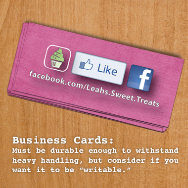
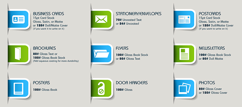
  • Cover: Cover stocks are heavier, somewhat rigid and not easily folded. These paper types are best for publication covers, business cards, greeting cards, folders, and postcards. They can have coated or uncoated finishes.
Paper-Types-Infographic_v2-light

Paper coating:
Coated – Coated paper has a waxy finish (shiny or matte). Coated papers are available in a gloss, silk (sometimes called satin) or matt finish and are used for projects requiring a fine finish. Coated paper can give the printed piece a classier look. Note: Do not use gloss if your product will be used for note-taking. Gloss finish is very difficult to write on.
Types of coating:
    magnets
  • UV Coating: (Ultra Violet): UV coating is a highly protective, ultra-shiny gloss coating. The solvent-free UV coating provides an extremely hard finish that’s chemical and abrasion resistant. It makes details really pop! It can be used on the entire piece or strategically placed on specific areas to make them stand out, such as a logo or photo.
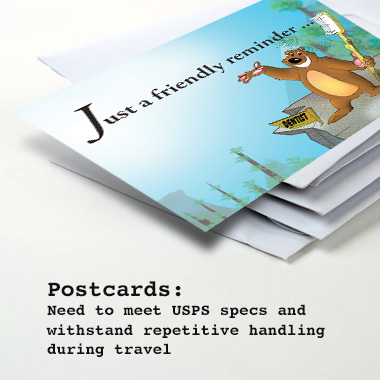
  • Aqueous-This is a clear water-based coating that is thinner than UV Coating. It provides a medium-gloss surface that deters dirt, fingerprints and scuff marks. It protects pieces such as postcards and brochures as they go through the mail, and business cards as they ride around in people’s pockets.
  • Coated One Side (C1S) – A cover stock that has a coating on one side and is dull on the reverse side. C1S papers are typically used for products like Holiday Cards or Birthday cards where you want the outside to pop with a glossy finish and for the inside to be writable.
  • Coated Two Sides (C2S) – A cover stock that has a coating on both sides. This is typically used for flyers, brochures, booklets, and handouts that will not be written on.
notepads

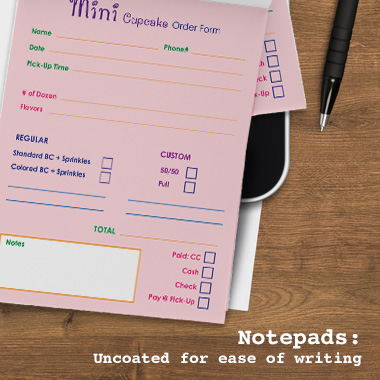
Uncoated - This paper has an untreated surface-resulting in a dull and unreflective look. Uncoated paper is typically used for letterhead, envelopes, and notepads. Premium uncoated paper can also be used to provide an earthier, more personal feel for important Invitations, Announcements, and Thank You cards.
The ink used to print your marketing piece will appear differently depending on the finish of your paper.
    business cards
  • Gloss – A gloss finish produces a shiny paper surface, such as that you’d find on a photograph. It can make full color images and graphics appear more vibrant and visually appealing. It also protects the ink from fading and moisture. Although images on high-gloss paper look great, the shine makes reading text off the page more difficult.
  • Satin – A satin finish falls somewhere between gloss and matte. It produces a slight sheen, enhancing full color images and graphics while preserving the readability of text.
  • Matte – A matte finish produces a smooth yet muted paper surface. It yields a more “artistic” feel to the finished product. Colors appear softer, and text-heavy documents may be easier to read. It also eliminates fingerprints.


postcards

Getting Specific:Common Paper types and uses


80# Gloss Text

This is standard glossy paper stock, about as thick as a light magazine cover. The shiny finish provides an excellent opaque base for rich process color printing. This is a very popular stock for brochure printing, catalog Inserts, flyers, posters, etc.

80# Gloss Cover

As a “cover” stock, this paper is stiff, about like a postcard or baseball card. This stock is coated with a glossy finish, making photographs and other images look beautiful. Standard uses: durable, heavy-weight Brochures, Catalog Covers, Product Spec Sheets.

80# Dull/Matte Text

This stock is finely coated with a non-gloss finish. It provides an excellent opaque base for easy to read, crisp typography. Standard Uses: Brochures, Newsletters, Catalog Inserts, and Flyers, etc.

80# Dull/Matte Cover

Most dull/matte cover is a typically around a 9 PT cover stock with a smooth, non-shiny coating. It is well suited for detailed, crisp printing without sacrificing the ability to easily write on the paper. Often selected with the 80# dull/matte text option for inside your catalog or booklet piece.

100# Gloss Text

Similar to the 80# gloss text, but 25% thicker and heavier, for a more substantial feeling piece. Standard uses: Brochures, Information Sheets, Direct mail pieces, Posters, Door Hangers, etc.

100# Dull/Matte Text

Thicker and heavier than 80# Dull/Matte text for a more substantial feeling piece. Provides a non-glossy, opaque base for detailed, crisp printing.

100# Uncoated Cover

An option for business cards, rack cards and bookmarks. This is smooth and typically around 14 PT in thickness.

110# Uncoated Matte

This paper is often referred to as card stock. This is a great choice when you want the details on your invitations to look crisp and clear, or when your postcards need to withstand a bit of abuse.
120# Gloss Cover
This has a high quality look. It is a glossy, coated finish to make photographs and other images look beautiful. Aqueous coating can be added for an even more protection and shine.

120# Dull/Matte Cover

This typically has a smooth, non-shiny coating. It is well suited for detailed, crisp printing without sacrificing the ability to easily write on the paper. An excellent choice for Business Cards, Postcards, Note Cards and Greeting Cards.

70# Uncoated Text

This is typically used for stationery, envelopes and newsletters. Many common stationery stocks are not optimized for 4-color printing. This paper feels substantial, and is the best type of uncoated paper stock available for full-color printing.

24# Uncoated and 28# Uncoated

This is a standard stock commonly used for envelopes, also called White Wove. The 28# is thicker and heavier than the 24#.

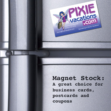
Magnet Stock or Magnetic Paper

Usually thicker- it should deliver high quality printing with excellent color reproduction and will stick to most metal surfaces. It’s a great choice for business cards, postcards, coupons, calendars, sport schedules, and menus.


article credit: overnightprint.com

6/17/13

30 Stunning Calendar Designs!


Looking for some calendar design inspiration? Then look no further as we reveal a host of inspirational designs.


Branching out into calendar design is a great way to bring in extra client work, promote your own portfolio, the company you work for, or maybe the product you produce. In this showcase of great calendar design we've tried to provide a good cross-section of examples, that offer unique and innovative calendar design approaches to one of the most traditional of products.

01. The Brain Calendar

calendar designs
This calendar design will scramble your brain if you stare at it too long
A great example of trompe l'oeil, this brain scrambling calendar design is a brilliant execution of a simple idea. Placing the month and dates in opposing positions allows this calendar to stand in an either portrait or landscape manner. We love the simple use of colour too - too many colours would have spoiled this one.

02. Bird in a book

calendar designs
The gorgeous animal illustrations make this calendar design perfect for kids
Created by Ukranian designer Anna Andreeva, this calendar in a book was initially crafted for children but we think almost anyone of any age would appreciate these gorgeous illustrations. See the full range of calendars in books over on her Behance page.
calendar designs
The colour scheme continues inside the book

03. Animal kingdom

calendar designs
A cute calendar design that features all the animals of the jungle
We're a sucker for cute character designs and so we instantly fell in love with this calendar design, which comes with a different animal for each month including a tiger, koala, monkey and racoon.

04. Alphabet 2014

calendar designs
A series of small triangles make up this intriguing calendar design
Student Sara Vrbinc was tasked with creating a calendar for 2014 using all the letters of an alphabet stretched over six sheets of paper. The calendar she created is divided into a grid of equivalent triangles. The user's task is to punch out one triangle per day; once the month runs out, the user can see a couple of letters in different colour combinations.

05. The seasons

calendar designs
The calendar design shows how minimalism should be done

6/14/13

SPOT UV Printing: Modern & Eye-catching designs!

Get Inspired!

Check out this 3 minute video showcasing different ways to use SPOT-UV coating on your business cards for a modern
and eye-catching design.


As the name suggests, a Spot UV coating or "varnish" is

applied to chosen spots (areas), of a printed card. This has 

the affect of highlighting and drawing attention to that part of 

the design, but it also provides the additional visual stimulus 

of having varied textures on a single printed surface. This 

adds a lot of interest, and can identify the printing as a 

premium piece in the perception of the reader.

6/11/13

Need a New Background on Your Computer or Phone? Check These 20 Downloadable Designs Out!


20 Creative & Artistic Digital Paper Backgrounds

20 Creative & Artistic Digital Paper Backgrounds

We're all familiar with backgrounds, but some folks may not realize that they can be used for more than just a desktop wallpaper. You can use backgrounds to help add colorful and unique accents to your website, paper goods, and creative projects. The background for your website or paper project really sets the tone and mood for your audience. Depending on the feeling and experience you want to provide, your background can help create a certain look and feel for your work.
We've gone through and selected some of the best creative and artistic paper backgrounds from the marketplace that follow the latest design trends. Any of these fantastic backgrounds can help create a stunning look for just about any of your creative projects, including websites. Check out our selections below and you can explore even more great backgrounds on Creative Market.

Arrow and Star Backgrounds

arrows-and-stars-fThese gorgeous arrows and star backgrounds are perfect for cards, invitations, and elements of Wordpress themes and websites. (Raster & Vector)

Vintage Whitewash Digital Papers

sa_cm-whitewash-fThese vintage whitewash digital papers will help add some delicate and feminine accents to your website or paper goods. (Raster)

Mint and Coral Digital Papers

mint-coral-sample-fMint and coral are two of the trendiest colors in the world, and these colorful papers will be the perfect background for your website or blog. (Raster)

6/7/13

59 MORE BRILLIANT PRINT AD'S! Get Inspired Today.


59 Interesting Print Ads From 22 Companies


We enjoy seeing intelligent print advertisements on which copywriters worked so hard for, and managed to create incredible a combination of visual cocktails for the eye and tasteful food for the mind. In this article, we featured 59 interesting print ads from 22 companies which understood that intelligent ads catch the customers’ attention and make the brand memorable.

Magic Scotch

Magic Scotch print advertising
Magic Scotch print advertising 2Magic Scotch print advertising 3

Duracell

Duracell print advertising
Duracell print advertising 2
Duracell print advertising 3

6/5/13

Attention Graphic Designers!


ARE YOU A FANTASTIC GRAPHIC DESIGNER?


The real world can be daunting for any new graduate. This info-graphic points to what lies ahead, and is full of advice in what can be a confusing situation.


When finishing up your design degree, it's daunting to think what career path lies ahead. It's difficult to figure out just how to get a career in graphic design but this helpful guide is one of the best infographics we've come across when it comes to graphic design career advice.

Courtesy of marketing and media experts Quin Street, the infographic offers an insight into an often confusing situation, with a look at the different mediums you can work with, who hires graphic designers and where you can earn the most. It also looks at careers related to graphic design in case you want to spread your creative wings a little further.
The simple layout and strong use of colour enables you to obtain all the information you need in one fell swoop. The facts and figures are geared towards the US, but designers everywhere should find it useful. Check it out and hopefully life after your degree won't seem so scary. 

 Check

 out

 the

 infographic

 below!


article credit: http://www.creativebloq.com

6/4/13

50 MORE INSPIRATIONAL BROCHURES!

50 MORE Beautifully Printed Brochure Designs For Your Inspiration


Getting tired of the dull trivial brochures that you get on the streets? When you receive brochures of this kind, what do you do with them? Do you take a quick look and then dump it in the nearest available trash can? That’s not what these brochure makers want.  Below are 50 more incredible printed brochure/booklet brochure designs that will help inspire your creativity. 
They want to hook you in, make you read the information inside. But in order to do that, they have to be pretty creative to make you keep reading.
Note also the influence of web design in modern print design – the use of headers, a lot of white space, and typography choices. 
_______________________________________________________